Launch of catchfire.finance!
Note: With the update to the Twitter (X) API and site we could no longer scrape data so we shut down the site. I am however working on something new involving graphs so stay tuned. (And will get data from a paid, known source = D)
Hey, today a friend and I launch an initial version of our website called catchfire.finance! On the site you can find real-time data about what is being talked about over social media in the world of finance. Our goal here is to give insights about what is being discussed and give a general sense of how people are talking about it through seven core human emotions: Joy, Fear, Anger, Sadness, Confidence, Tentativeness, and Analytical. We wanted to give more in-depth views of sentiment than just the typical positive and negative.
This is sort of initial release so were still testing how well it performs with visitors and cleaning up some bugs. Also seeing how large of a compute cluster we might need to handle traffic.
On our site, we have two main pages to find information, the home, and ticker pages.
Home Page
On the home page, you can find two graphs.
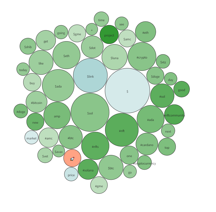
On the top is a Word Cloud showing the most popular terms over the past 2 days. If you put the mouse over a circle it will display the emotion most connected with that word.
The darkness/magnitude of each circle is determined by how heavily that word is used for that emotion. If it is light that word shows up equally in all emotions. If it is dark it is more exclusive for that emotion.
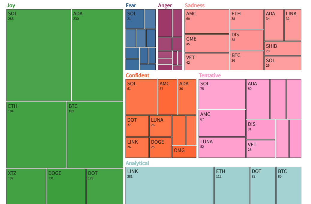
Then on the bottom is a TreeMap displaying the top tickers correlated with each emotion. The size of the square is how many mentions there are of that ticker with that emotion.
The darkness/magnitude of each circle is determined by how much of that sentiment is shown over the short term (1 day) versus the long term (7 days). Dark means that the short-term sentiment count is a lot compared to its long-term amount. Light means that short-term sentiment count is small compared to its long-term amount.
Ticker Page
On the ticker page, you can find more individual information about specific tickers. To do this you put in a ticker inside the search bar like “BTC” for Bitcoin or “TSLA” for Tesla. Once you put in tickers on the top three main charts will show up.

The top is the line graph component. The top of it shows the selected data items from the control panel underneath. The control panel consists of data items each of which you can select which ticker you want to see data for, the type of data for that ticker, the color of the line, and the shape of that line. You can add and remove data items through the buttons to the right and bottom. By default, a line showing all social media snippets will appear.
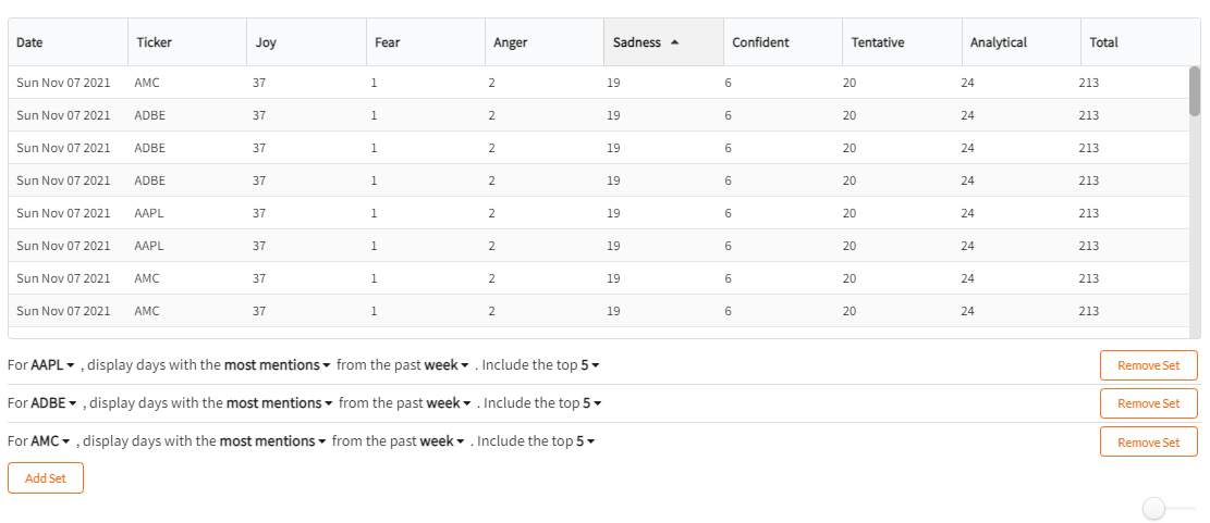
In the middle is the mention table. The top of this component displays the days with the most mentions of a specific keyword/emotion combo from its control panel. The control panel consists of data items each of which you can select which ticker you want to see data for, the emotion to look up, the number of days you want to look in the past, and the top X amount of days to lookup.
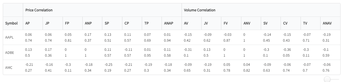
The bottom is the correlation table. This table shows the r-value and two-tailed p-test values between each emotion and price/volume. (Pearson Correlation). The top value is the r-value and the bottom value is the p-value.
The Model
Then I just want to go some into what drives the data on this site. We pretty much used typical NLP methods to create a classifier that could assign an emotion to a short string of text. There are many steps that were needed to actually achieve the ability to reliably classify important snippets from social media.
We needed the ability to sort out spam and posts in general that are not worth processing. We wanted to only grab snippets with a certain amount of following.
Next, each snippet is in very rough form with bad grammar, emojis, tags, and punctuation. We created a process to normalize all of these snippets to somewhat consistent sentences that the model can understand.
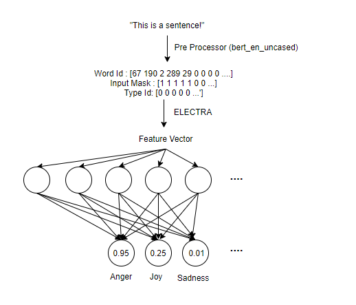
For the model, we used a BERT-like model from TFHub called ELECTRA: https://tfhub.dev/google/electra_base/2. This is essentially most of the smarts when it comes to the classifier we have. But the model consisted of the Preprocessing Layer to get a sentence into an ELECTRA Readable form, then into the ELECTRA encoder which classifies the data into a reduced dimension, a dropout layer to normalize the data, and then finally a dense layer to classify into the seven emotions.
Once we had a trained model we just hosted it on a machine and away we went.
I will probably later make a more detailed post describing how exactly our model is structured and trained, but just wanted to give a high-level view of what’s going on.
Next Steps
There’s a ton to still do to the site but we wanted to start getting it out there to get feedback and start finding some bugs. Since we are just a team of two it’s hard to do extensive testing on all browsers on all devices. In terms of improvement were mostly looking at:
Improving the Front End to be more Reliable
Make the site more scalable and deployable.
Add more sources for social media snippets.
In terms of brand new features I think it would be cool to focus on:
Look for unusual activity for tickers over social media to detect bots.
Do more news analysis and see how each news site trends in terms of one of the emotional states.
But you can be a part of this process if you join our Discord: https://discord.gg/4cEbUjtwyr . Give feedback, tell us bugs, suggest improvements, or just come hang out.
Thanks for reading and make sure to go check out catchfire.finance!